Brand Consistency, Templates & Efficient Workflow
Create a repeatable design workflow with templates, brand rules, reusable components, naming conventions and quality checks.
Before you start
Open Canva in a separate tab and complete the actions while you read. This course is designed for active practice, not passive scrolling. Keep one folder named Canva Course Practice and save every module project there.
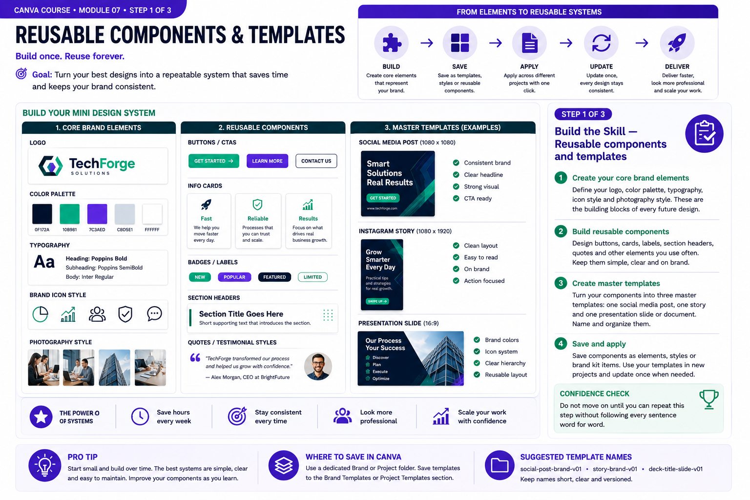
Build the Skill — Reusable components and templates
- Start by defining the core elements of a small brand system: logo usage, color palette, heading and body typography, icon style and photography direction. Keep the system simple enough that you can apply the same decisions consistently across different projects.
- Turn repeated design patterns into reusable components. Create consistent buttons, labels, information cards, section headers and other elements you use frequently. Preserve their spacing, typography and visual treatment instead of rebuilding them differently every time.
- Use those components to build three master templates: one social media post, one vertical story and one presentation slide or business document. Name each template clearly, save it in an organized Canva folder and test it with different content to confirm that the system remains flexible and consistent.
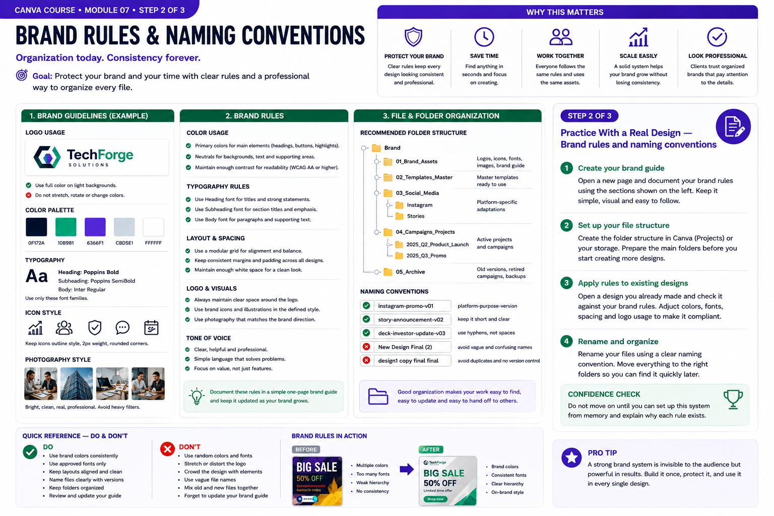
Practice With a Real Design — Brand rules and naming conventions
- Create a simple one-page brand guide that documents the rules behind your visual identity. Define approved logo usage, primary and supporting colors, heading and body typography, icon style, photography direction and basic spacing rules so future designs can follow the same system.
- Organize your Canva projects using clear folders for brand assets, master templates, social media, campaigns and archived work. Separate reusable files from active projects so important assets are easy to find and accidental edits to master templates are less likely.
- Create a naming convention that communicates platform, purpose and version. Use clear names such as instagram-promo-v01, story-announcement-v02 or deck-client-proposal-v03 instead of vague names such as New Design Final or final-copy-2. Apply the system to several existing designs and move them into the correct folders.
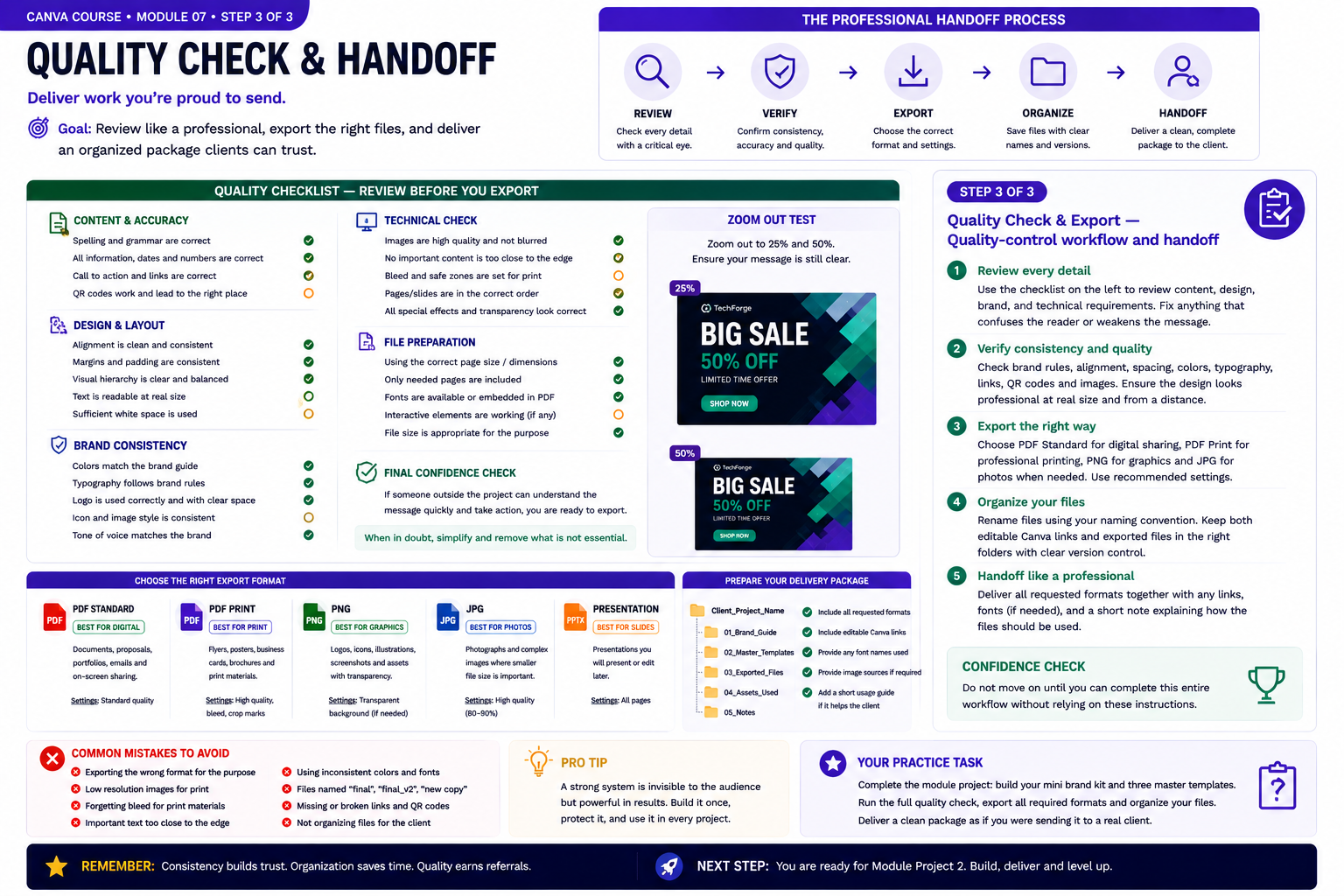
Quality Check & Export — Quality-control workflow and handoff
- Review the project systematically before export. Check spelling, dates, numbers, links, QR codes, alignment, margins, hierarchy, readability and brand consistency. Zoom out and inspect the design again to confirm that the main message remains clear at a glance.
- Verify technical quality at the final viewing size. Confirm that images remain sharp, important content stays inside safe areas, colors and typography follow the brand guide, pages are in the correct order and interactive elements work where applicable.
- Prepare the project for professional handoff. Export only the formats required for the intended use, apply your naming convention, keep editable Canva files separate from exported deliverables and organize everything into clearly labeled folders. Reopen the exported files for one final inspection before considering the project complete.
Knowledge checkpoint
- Can you explain the main principle of this module in your own words?
- Can you reproduce the core workflow without restarting the lesson?
- Can you identify at least one weak design decision and explain how you would improve it?
- Can you export the result in a format appropriate for its intended use?
Build this before continuing
Build a reusable mini brand kit and three master templates.
Completion standard: create a first version, review it, make at least three deliberate improvements, export the final version and keep both versions so you can see your progress.
Ready to move on?
You are ready when you can complete the module project confidently without depending on the example for every decision. The goal is not memorizing Canva buttons — it is learning to make sound visual decisions on your own.
Brand Consistency, Templates & Efficient Workflow: Practical Expansion
Defining the Rules of a Visual Identity
Brand consistency begins with a small set of repeatable decisions. These may include primary and secondary colors, heading and body fonts, logo usage, image style, icon style, spacing and common layout patterns. Consistency does not require every design to look identical. It means the audience repeatedly encounters recognizable visual characteristics. A campaign can use different photographs and compositions while maintaining the same typography and color logic. Write down the decisions instead of relying on memory. Even a simple reference page containing font names, color values and examples of approved components reduces accidental variation. When making a new design, compare it with the reference. Ask whether it still looks like part of the same identity before adding new decorative styles.
Creating Master Templates
A master template should preserve the structural decisions that are expensive to recreate repeatedly. Set margins, logo placement, typography, brand colors and common components before creating multiple versions. Protect the master by duplicating it for each new project. If the original is constantly edited, useful reference layouts can gradually disappear. Templates should include enough structure to accelerate work while leaving room for content. A template that is too rigid forces every message into the same composition, while one that is too empty provides little advantage. Create several approved layouts for different purposes rather than one universal template. A brand may need separate systems for educational posts, promotions, presentations and documents.
Speed Through Reusable Components
Efficient designers avoid rebuilding the same visual objects repeatedly. Group frequently used combinations such as logo plus tagline, call-to-action blocks, heading treatments or testimonial cards. Maintain consistent spacing within each component. When the component is reused, the relationship between its parts remains stable even if the entire group is moved. Duplicate pages when a new design shares most of the previous layout. This is usually faster and more consistent than recreating the structure manually. Efficiency should not eliminate review. Faster production is useful only when the result remains accurate, readable and appropriate for the new content.
Version Control and File Organization
Simple organization prevents expensive mistakes. Name projects clearly and distinguish draft versions from approved versions. If several campaign variations exist, include the platform, format or date in the project name. Avoid repeatedly overwriting the only version of an important design. Duplicate major milestones before experimental changes. This allows you to return to a known-good version if the experiment fails. Organize related projects into folders when available and establish a predictable naming convention. A clear archive becomes increasingly valuable as the number of clients or campaigns grows. Before delivery, confirm that the file being exported is actually the approved version. This simple check prevents sending an outdated design.
Building a Personal Quality-Control Checklist
Create a short checklist that you use before every export. It may include spelling, alignment, margins, logo treatment, color consistency, image quality, hierarchy and correct dimensions. For multi-page projects, verify that recurring elements remain in the same position and that page order makes sense. For social media, preview at small size. For documents, inspect reading comfort and page breaks. Check links or QR codes when they are included. A visually perfect asset still fails if an important destination is incorrect. A repeatable quality-control process turns good habits into a reliable workflow. Efficiency is not simply working faster; it is reducing preventable errors while maintaining consistent output.
Practice: Build a Brand Template Library
Choose a fictional company and define its visual rules on one Canva reference page. Include colors, fonts, logo spacing, image style and example components. Then create three master templates: a social post, a presentation slide and a one-page business document. Duplicate each template and add different content without changing the core visual identity. Place all versions together and look for inconsistencies. Correct any font, spacing or color choices that drifted away from the system. The completed exercise becomes a miniature brand library and demonstrates how clear rules, templates and organization can dramatically reduce production time while improving consistency.
Creating Rules That Other People Can Follow
A strong brand system should be understandable even when another designer or team member uses it. Instead of relying on personal memory, document why certain colors, fonts, spacing patterns and image treatments are used. Clear rules make the brand easier to maintain as the number of assets grows.
Distinguish between fixed rules and flexible choices. A logo may always need a minimum amount of clear space, while photography can vary within an approved visual style. This distinction prevents a brand from becoming either inconsistent or unnecessarily rigid.
Template Maintenance
Templates should be reviewed periodically. If a recurring layout constantly needs the same manual correction, update the master template rather than repeating the correction on every new design. This turns real project experience into a better production system.
Remove outdated information from master files and keep only approved components. Too many abandoned variations inside one template make it harder to know which version should be used. A clean template library saves more time than a large but disorganized one.
Creating an Efficient Approval Workflow
When working with clients or teams, decide how revisions will be tracked. Use clear version names and avoid sending several files called final. A simple sequence such as draft-01, revision-01 and approved-final makes communication easier.
Keep feedback connected to the correct version. If several people review different exports simultaneously, conflicting comments can create unnecessary rework. A controlled approval process is part of efficient design production.
Consistency Across Different Designers
Brand consistency becomes especially important when more than one person creates content. Reference pages, approved templates and component libraries reduce individual interpretation. The goal is not to remove creativity but to create boundaries within which creativity can happen safely.
Review several completed assets together rather than evaluating each one alone. Small inconsistencies in logo size, heading treatment or spacing become easier to notice when designs are compared side by side. Correcting those patterns strengthens the entire visual system.
Auditing Brand Consistency Over Time
As a brand produces more content, periodically review several recent designs together. Individual assets may look acceptable on their own while small inconsistencies gradually appear across the complete collection. Compare logo size, type hierarchy, spacing, colors, image treatment and calls to action.
When a recurring inconsistency appears, update the reference system or master template rather than correcting only one file. This keeps future production aligned and reduces repeated decisions. Brand consistency is not a one-time setup task; it is an ongoing process of maintaining clear rules while allowing enough flexibility for different messages and formats.