Presentations, Documents & Practical Business Assets
Create useful real-world assets: presentations, flyers, simple proposals, certificates, resumes and PDF documents.
Before you start
Open Canva in a separate tab and complete the actions while you read. This course is designed for active practice, not passive scrolling. Keep one folder named Canva Course Practice and save every module project there.
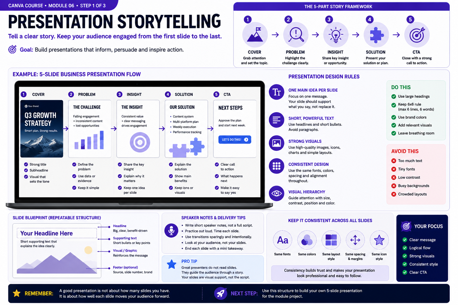
Build the Skill — Presentation storytelling
- Create a five-slide business presentation and plan the story before decorating it. Structure the sequence as Cover, Problem, Insight, Solution and Call to Action so every slide has a clear purpose in moving the audience forward.
- Give each slide one main idea. Use a strong headline, short supporting text and one relevant visual or data point instead of filling the canvas with paragraphs. Keep fonts, colors, margins and visual style consistent throughout the presentation.
- Run the presentation from beginning to end and check whether the story still makes sense without extra explanation. Remove repeated information, strengthen weak transitions and make sure the final slide gives the audience a clear next action. Save this version before continuing.
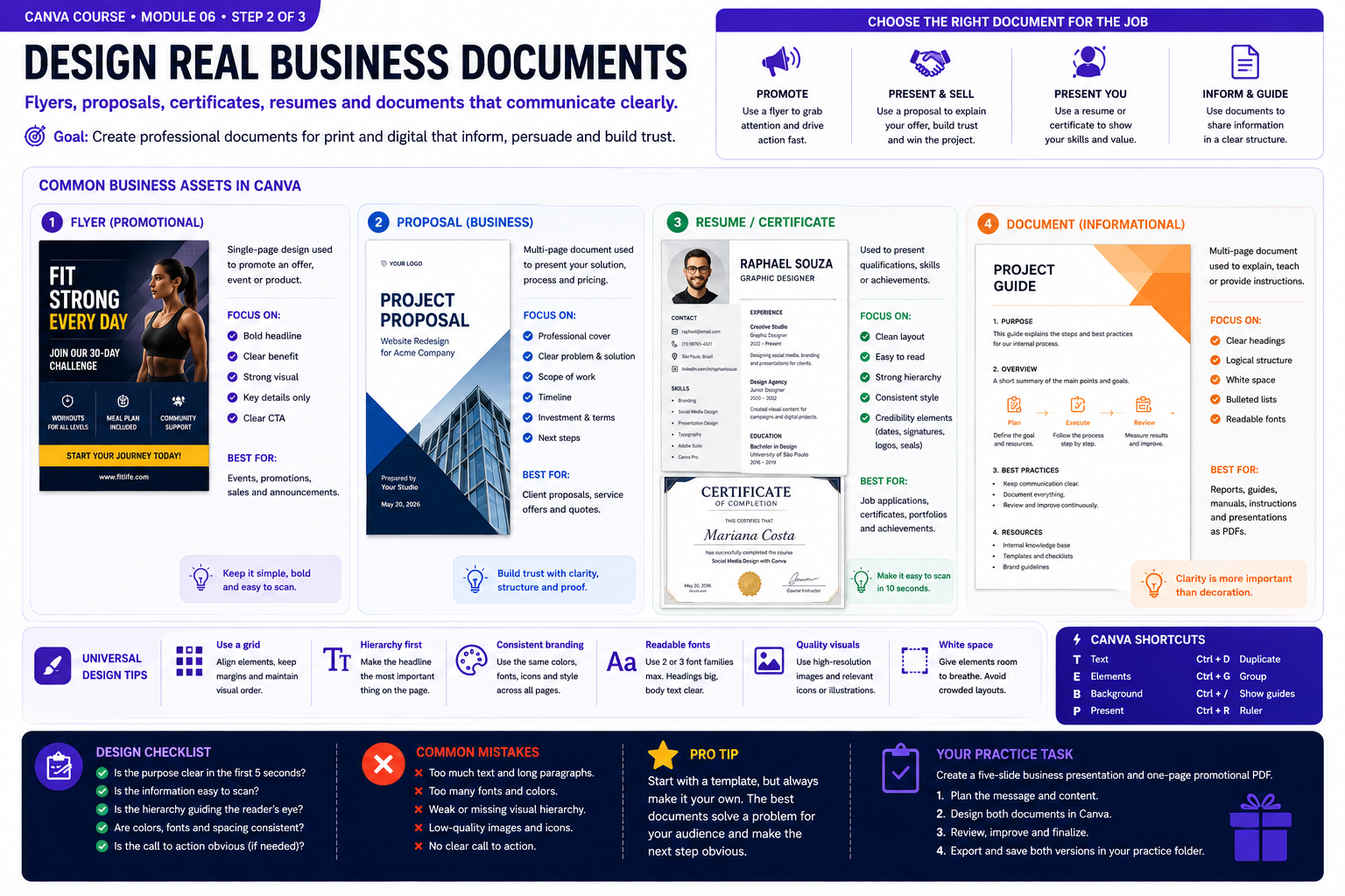
Practice With a Real Design — Flyers, proposals and documents
- Choose a real business purpose before designing. Compare a promotional flyer, client proposal, resume or certificate, and informational document. Notice how each format requires a different balance of headlines, supporting information, visuals and calls to action.
- Build a one-page promotional document with a clear visual hierarchy. Use a strong headline, concise supporting information, consistent margins, readable typography and enough white space for the reader to scan the page quickly. Add only visuals that support the purpose of the document.
- Review the document as if you were receiving it from a real business. Check whether its purpose is obvious within seconds, whether important information is easy to find and whether the next action is clear. Remove unnecessary decoration and correct weak alignment, spacing or hierarchy before saving the final version.
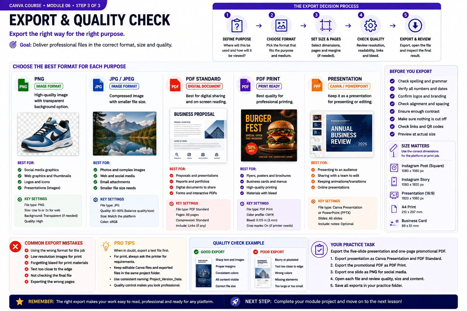
Quality Check & Export — PDF, PNG and presentation export decisions
- Decide how the finished design will be used before exporting it. Compare PNG for high-quality graphics, JPG for smaller photographic files, PDF Standard for digital documents, PDF Print for professional printing and presentation formats when the slides still need to be presented or edited.
- Run a pre-export quality check. Verify spelling, dimensions, page selection, margins, image quality, contrast, links and QR codes where applicable. For printed materials, confirm bleed and printer requirements before creating the final file.
- Export your five-slide presentation in a presentation-friendly format and create a PDF copy for sharing. Export the promotional document as a PDF and one selected graphic as PNG. Reopen every exported file and inspect readability, cropping, page order and image quality before considering the work finished.
Knowledge checkpoint
- Can you explain the main principle of this module in your own words?
- Can you reproduce the core workflow without restarting the lesson?
- Can you identify at least one weak design decision and explain how you would improve it?
- Can you export the result in a format appropriate for its intended use?
Build this before continuing
Build a five-slide business presentation plus a one-page promotional PDF.
Completion standard: create a first version, review it, make at least three deliberate improvements, export the final version and keep both versions so you can see your progress.
Ready to move on?
You are ready when you can complete the module project confidently without depending on the example for every decision. The goal is not memorizing Canva buttons — it is learning to make sound visual decisions on your own.
Presentations, Documents & Practical Business Assets: Practical Expansion
Designing Slides Around One Main Idea
A presentation slide should support communication rather than become a document filled with every sentence the presenter intends to say. Start by identifying the single idea each slide needs to communicate. The title, supporting text and visuals should reinforce that idea. Large blocks of text force the audience to choose between reading and listening. Reduce paragraphs to essential points and use the speaker or accompanying explanation to provide detail. Maintain consistent margins and recurring positions for titles, page numbers and visual elements. This creates rhythm across the presentation and allows the audience to concentrate on information instead of constantly adapting to a new layout. Use visual emphasis selectively. If every word is bold, every shape is colorful and every slide uses a different effect, nothing feels important. Controlled repetition produces a more professional result.
Turning Information Into Visual Structure
Business documents often contain information that can be organized more clearly with hierarchy. Separate headings, supporting paragraphs, lists, statistics and calls to action into recognizable groups. When information has a sequence, use numbered steps or a simple timeline. When several items have equal importance, cards or columns may work better. When one statistic matters most, give it enough size and space to become the focal point. Do not convert every sentence into an icon or diagram. Visualization is useful when it makes relationships easier to understand. Sometimes a well-spaced paragraph is clearer than an unnecessary graphic. Review the document by scanning only the headings and emphasized elements. A reader should be able to understand the structure before reading every detail.
Creating Professional PDFs and Handouts
Canva can be used for guides, checklists, worksheets, proposals and informational PDFs. Documents require special attention to readability because users may spend more time reading them than they would a social media post. Use comfortable body-text sizes, sufficient line spacing and consistent page margins. Avoid placing long paragraphs over photographs or highly decorative backgrounds. Headers and footers can carry page numbers, document titles or brand information. Keep these elements subtle enough that they support navigation without competing with the main content. Before exporting, inspect every page for unexpected text wrapping, isolated headings and inconsistent spacing. Open the exported PDF and verify that page order and visual quality match the editor.
Business Assets and Reusable Components
Many organizations repeatedly need similar assets: proposals, price lists, service menus, certificates, internal guides, social banners and presentation covers. Building reusable Canva components reduces the time required for each new request. Create standardized heading styles, buttons, information cards, testimonial blocks and image treatments. These components can be copied between pages while maintaining the same visual language. Leave flexible areas for content that changes. A reusable proposal template, for example, may have stable branding and section structure while allowing project details and pricing to vary. A good template reduces decisions without making every document look generic. The designer defines the system once and then adapts it intentionally.
Practice: Build a Small Business Kit
Create a fictional business and produce a five-slide presentation, a one-page service sheet and a short two-page PDF guide. Use the same colors, typography and visual language throughout. Make sure the presentation works on a screen while the document remains comfortable to read as a PDF. The assets should feel related even though their formats have different requirements. Review alignment, margins, heading hierarchy and export settings. Correct inconsistencies rather than treating each file as a separate project. This exercise demonstrates how Canva can support an entire communication system, not merely isolated graphics. Professional workflow comes from adapting one visual identity intelligently across different practical formats.
Designing Information for Different Reading Situations
Business assets are not all consumed in the same way. A presentation may be viewed from several meters away, while a proposal PDF may be read closely on a laptop. A worksheet may be printed, and a service menu may be viewed quickly on a phone. The design must respond to those different reading conditions.
For presentations, reduce the amount of information shown at once and use stronger hierarchy. For documents, allow comfortable paragraph width and spacing. For printable material, keep important content away from edges and verify that colors and contrast remain useful when printed.
Building Clear Information Sections
When a business document contains many topics, divide the content into predictable sections. Use consistent heading styles, spacing and visual separators. Related information should remain close together, while unrelated sections need enough space to feel distinct.
Cards, columns and highlighted boxes can help organize information, but they should not be used automatically. If a simple heading and paragraph communicate the information more clearly, additional containers may only add visual noise. Structure should simplify reading, not decorate every sentence.
Working With Tables, Prices and Comparisons
Price lists and comparison graphics require careful alignment because users often scan vertically and horizontally. Keep related numbers aligned, use clear labels and avoid decorative backgrounds that reduce readability. If one option is recommended, emphasize it without making the alternatives difficult to understand.
Always verify numerical information before export. A beautiful proposal with an incorrect price, date or contact detail is still a failed business asset. Accuracy is part of design quality.
Preparing Files for Delivery
Professional delivery includes organization. Use descriptive filenames, separate editable source files from exported deliverables and confirm the correct version before sending. Open the exported PDF or image after download and inspect it outside Canva.
Check page order, image quality, text wrapping and clickable links where applicable. These steps take only a few minutes but prevent many common delivery mistakes. A finished business asset should not only look polished inside Canva; it should remain reliable after export and in the environment where the recipient will actually use it.
Checking Business Assets in Real Use
Before final delivery, test the asset in the environment where it will actually be used. View presentation slides at full-screen size, open PDFs on both desktop and mobile, and print a sample page when the document is intended for physical distribution. These checks reveal problems that may not be obvious inside the Canva editor.
Pay attention to text size, page breaks, image sharpness, margins and contrast. Confirm that contact information, prices, dates and links are correct. If the document will be shared digitally, use filenames that clearly identify the content and version. Professional design includes these practical details because the final asset must remain useful after it leaves the design workspace.