Social Media Design Systems
Create reusable content for Instagram, Facebook, LinkedIn and other channels while keeping a consistent brand look.
Before you start
Open Canva in a separate tab and complete the actions while you read. This course is designed for active practice, not passive scrolling. Keep one folder named Canva Course Practice and save every module project there.
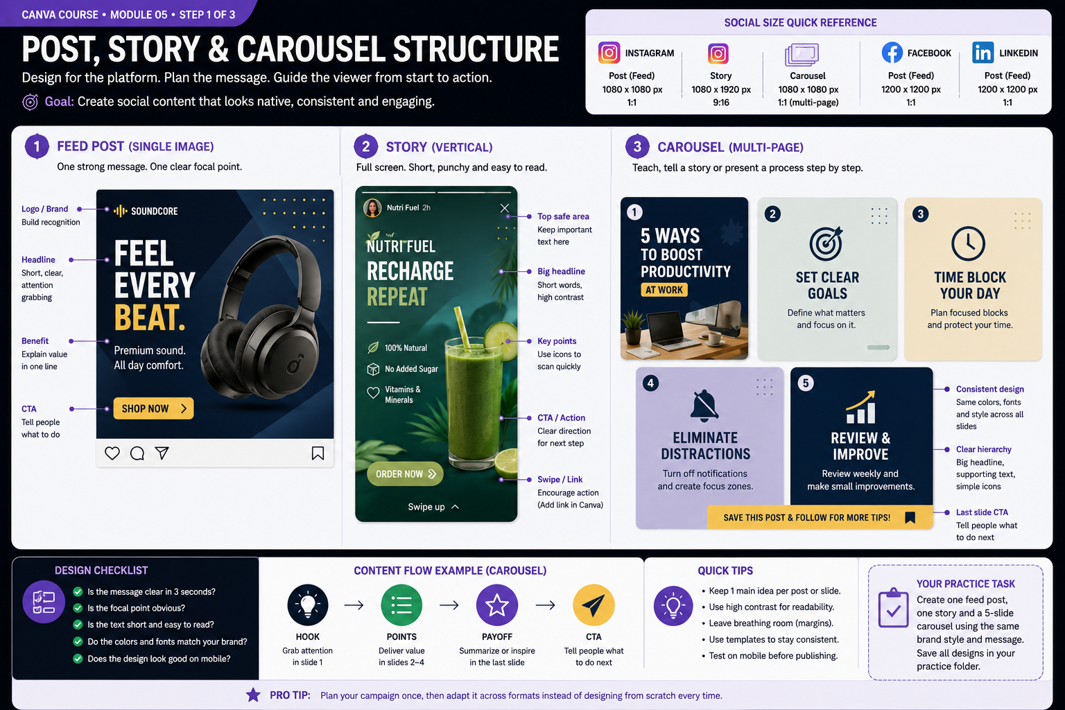
Build the Skill — Post, story and carousel structure
- Create three versions of the same campaign idea: a square feed post, a vertical story and a multi-page carousel. Keep the core message and visual identity consistent while adapting the composition to each format.
- Give each format a clear purpose. Use the feed post for one strong message, make the story fast to understand on a vertical screen, and structure the carousel as a sequence with a hook, useful information and a final call to action.
- Preview every design at realistic mobile size. Check that headlines remain readable, important content stays inside safe areas and the viewer can understand the main message quickly. Save all three versions in your Canva Course Practice folder.
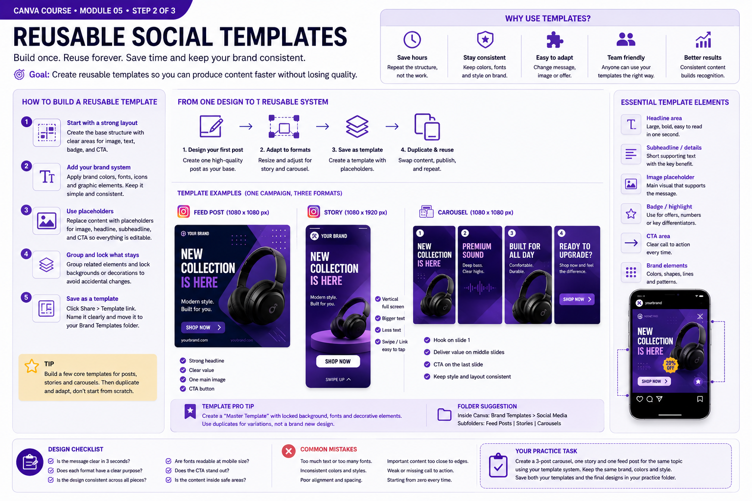
Practice With a Real Design — Reusable social templates
- Choose one of your strongest social designs and turn it into a reusable master template. Keep permanent brand elements such as colors, fonts and decorative styles consistent, while creating clear areas where headlines, images and calls to action can be replaced.
- Organize the template so another person could reuse it without rebuilding the layout. Group related elements, lock backgrounds or decorations that should not move, and keep editable content easy to identify and replace.
- Duplicate the master template three times and create a feed post, story and carousel variation. Replace the content while preserving the same typography, colors, spacing and visual language, then compare the designs to confirm that they clearly belong to the same brand system.
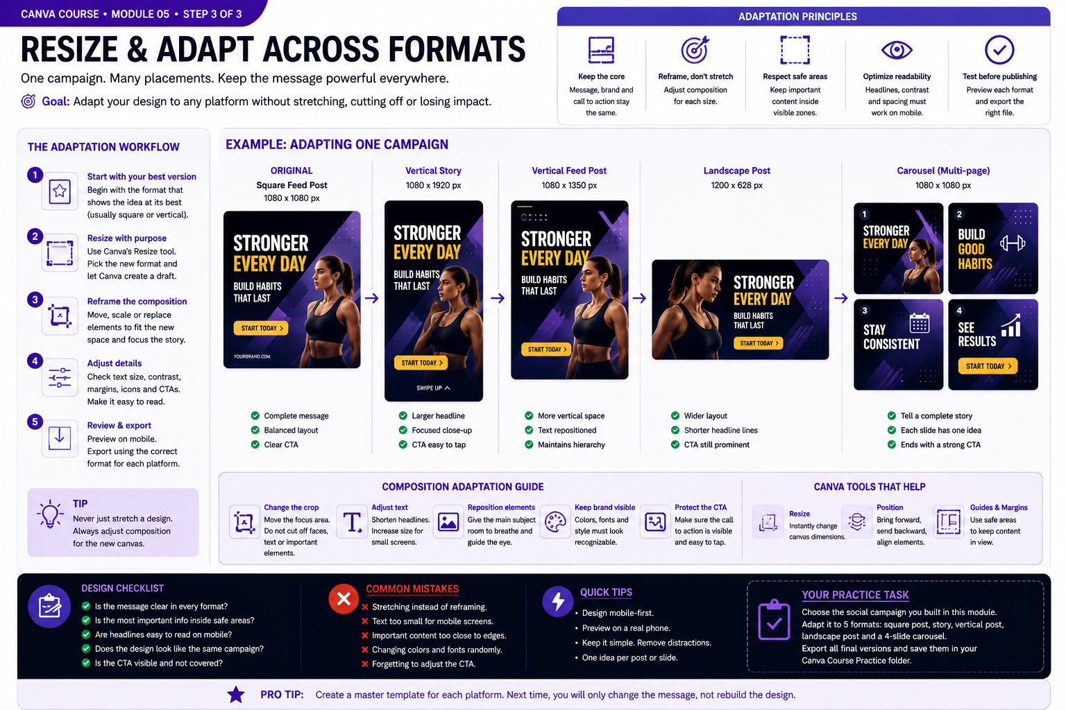
Quality Check & Export — Resize/adaptation workflow across formats
- Choose the strongest design from your campaign as the master version. Duplicate it and adapt the composition for a square feed post, vertical story, portrait post, landscape placement and carousel instead of stretching the original layout.
- Reframe each format deliberately. Reposition or crop the main image, resize headlines, protect safe areas and move supporting elements so the hierarchy remains clear on every canvas. Keep the same colors, fonts and core message across the campaign.
- Preview every version at realistic viewing size, especially on mobile. Check readability, margins, image cropping and call-to-action visibility, then export the final formats and compare them side by side to confirm that they feel like one consistent campaign.
Knowledge checkpoint
- Can you explain the main principle of this module in your own words?
- Can you reproduce the core workflow without restarting the lesson?
- Can you identify at least one weak design decision and explain how you would improve it?
- Can you export the result in a format appropriate for its intended use?
Build this before continuing
Build a five-piece social campaign from one visual system.
Completion standard: create a first version, review it, make at least three deliberate improvements, export the final version and keep both versions so you can see your progress.
Ready to move on?
You are ready when you can complete the module project confidently without depending on the example for every decision. The goal is not memorizing Canva buttons — it is learning to make sound visual decisions on your own.
Social Media Design Systems: Practical Expansion
Designing for the Platform, Not Just the Canvas
Social media graphics are viewed in very different conditions from presentations or printed documents. A design may appear large inside Canva but reach the audience as a small image on a phone while competing with dozens of other posts. For that reason, social media design should prioritize immediate clarity. The central subject, headline and call to action need to survive reduction in size. Begin each project by defining the purpose of the post. Educational content, promotional offers, announcements, testimonials and engagement posts each require a different emphasis. An educational carousel needs progression between slides, while a promotional graphic needs the offer and next action to be obvious quickly. Avoid placing important information too close to the edges. Social platforms may crop previews or cover areas with interface elements. Keeping essential text and logos within a comfortable safe area protects the message across different displays. Preview the design at small size before finishing. If the headline becomes difficult to read or the main subject disappears into background detail, simplify the composition rather than hoping viewers will zoom in.
Building Repeatable Post Templates
A social media system becomes faster when recurring content uses reusable structures. Instead of designing every post from zero, create templates for common formats such as tips, quotes, product features, announcements and calls to action. A template should define recurring decisions: logo position, headline area, type hierarchy, margins, image treatment, accent colors and footer information. The content can change while these structural decisions remain stable. Do not make every template identical. Build a small family of layouts that clearly belong to the same brand. One may emphasize photography, another may emphasize large typography and another may support a list or educational sequence. When creating a new post, duplicate the appropriate template rather than editing the original master. This protects the reference design and allows experiments without damaging future work.
Creating Effective Carousel Sequences
A carousel should feel like one continuous experience rather than a collection of unrelated graphics. The first slide needs to establish a clear reason to continue. The following slides should develop one idea at a time, and the final slide should provide a conclusion or next action. Use consistent placement for recurring elements such as page numbers, section labels and branding. This reduces cognitive effort because the viewer learns where information will appear. Keep individual slides focused. If one slide contains several unrelated ideas, split the information. Carousels benefit from pacing: introduction, development, example, clarification and conclusion can each receive their own space. Review the sequence in page order before exporting. A strong individual slide can still disrupt the experience if its hierarchy, color or spacing suddenly changes from the rest of the carousel.
Calls to Action and Conversion-Focused Graphics
A call to action tells the viewer what to do after understanding the message. Examples include visiting a page, saving a post, reading another slide, requesting information or exploring a product. The call to action should be visually noticeable without overpowering the main message. Use contrast and spacing to separate the action from supporting information. A button-style shape, accent color or clear text block can help, but avoid adding several competing actions to the same graphic. The wording should be specific. A short action such as Learn More, View Course or Save This Guide is easier to process than a vague paragraph explaining what the viewer should do. Evaluate whether the design still communicates its purpose if the viewer spends only a few seconds looking at it. Social media design succeeds when structure, content and visual identity work together quickly.
Practice: Build a Mini Content System
Create a fictional brand and produce four related social assets: one educational post, one promotional post, one testimonial and one three-slide carousel. Use the same type system, color palette and logo treatment across all assets. After creating the first versions, place them side by side. Check whether they look like one brand without becoming repetitive. Adjust spacing, image treatment or typography where the relationship feels weak. Then preview each design at approximately phone size. Simplify anything that becomes difficult to read. Export the final set and inspect the files outside Canva. This exercise demonstrates the difference between designing isolated posts and building a repeatable social media system. The second approach saves time, improves recognition and makes future content easier to produce.
Planning Content Before Designing
A consistent social media system begins before Canva is opened. Decide what type of content will be published, how frequently each format will appear and what role every post plays. Educational posts can teach one useful idea, promotional posts can explain an offer, authority posts can demonstrate knowledge and engagement posts can encourage interaction. When these roles are planned in advance, visual templates can be created around real communication needs instead of random topics.
Build a small content matrix containing the format, objective, audience action and visual treatment for each recurring type of post. This makes production faster because you are not solving the same strategic problem every time. The design process becomes a controlled adaptation of an existing system.
Adapting One Message Across Formats
A useful professional exercise is to take one message and adapt it into a square post, vertical story and multi-slide carousel. Do not simply resize the original graphic. Reorganize the hierarchy for the available space. A story can use more vertical movement, while a square post may need a stronger central composition. A carousel can divide the information into a sequence rather than showing everything at once.
This process teaches an important distinction between brand consistency and layout repetition. The typography, colors, image style and tone can remain recognizable while the composition changes to match the platform. A strong design system provides rules that can adapt rather than forcing every asset into one fixed arrangement.
Final Social Media Quality Check
Before exporting a social graphic, verify spelling, image quality, account names, dates, prices and calls to action. Preview the design at small size and confirm that the headline remains readable. Check whether the logo is visible without becoming the dominant element and whether enough space surrounds important information.
Finally, compare the asset with other posts from the same campaign. The new design should feel connected to the existing visual identity while still serving its specific purpose. This final comparison is what turns a collection of individual graphics into a coherent social media system.
Maintaining a Sustainable Posting System
A strong social media workflow should also be realistic to maintain. Instead of creating a completely new visual language for every post, decide which parts of the system can remain stable and which parts should change. Typography, brand colors, logo treatment and spacing can remain consistent while imagery, headlines and composition vary according to the message.
Review performance and practical production time as the system grows. If one template consistently takes too long to adapt, simplify it. If important information repeatedly becomes difficult to read on mobile screens, redesign that structure. A useful content system should improve both visual consistency and production efficiency. The goal is to make future posts easier to create without making them look repetitive or disconnected from the brand.