Images, Backgrounds, Elements & Visual Editing
Work confidently with photos, crops, frames, transparency, backgrounds, shapes, icons and layered compositions.
Before you start
Open Canva in a separate tab and complete the actions while you read. This course is designed for active practice, not passive scrolling. Keep one folder named Canva Course Practice and save every module project there.
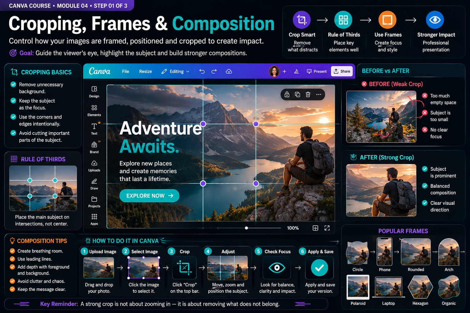
Build the Skill — Cropping, frames and composition
- Upload a photo with a clear subject and place it on a blank design. Crop the image to remove unnecessary areas, then reposition the subject inside the crop instead of accepting the first framing automatically.
- Create three versions of the same photo. Test a centered crop, a rule-of-thirds composition and a tighter crop. Compare how each version changes the focal point, visual balance and amount of useful negative space.
- Add the photo to at least two different Canva frames and reposition it inside each frame. Choose the version that supports the subject without cutting important details, then save your strongest composition before continuing.
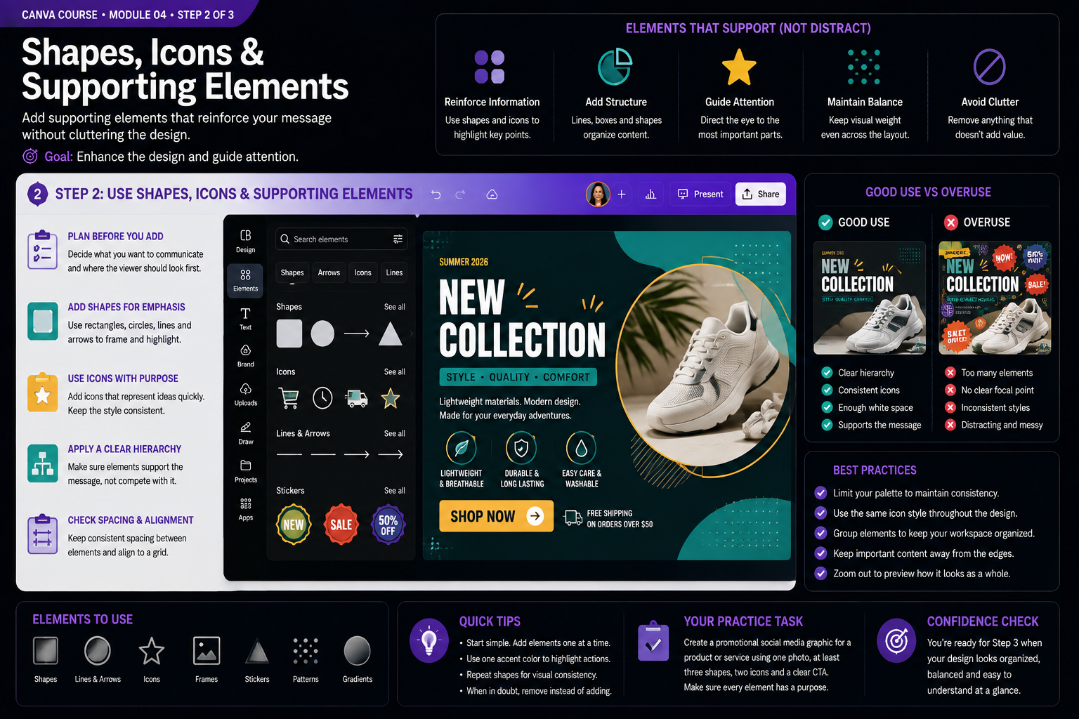
Practice With a Real Design — Shapes, icons and supporting elements
- Create a promotional design using one photo as the main focal point. Add simple shapes, lines and icons only where they help organize information, highlight a benefit or guide attention toward an important message.
- Keep supporting elements visually consistent. Use related icon styles, repeat shapes deliberately and maintain predictable spacing and alignment. Remove decorative elements that compete with the headline, product or main call to action.
- Duplicate the page and intentionally overload the second version with extra icons, shapes and decorations. Compare both versions, identify what creates visual noise, then return to the cleaner design and keep only elements that serve a clear purpose.
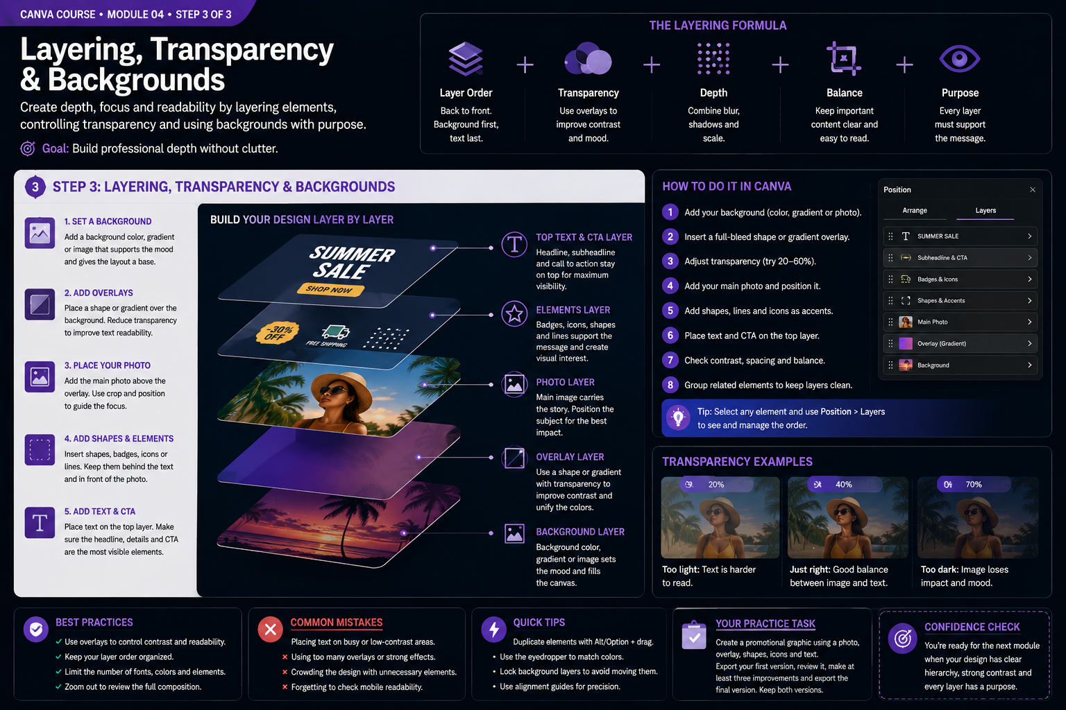
Quality Check & Export — Layering, transparency and backgrounds
- Build the composition from back to front: start with a background, add an overlay, position the main photo, place supporting shapes or icons, and keep important text and the call to action on the upper layers.
- Experiment with overlay transparency and compare several levels. Choose enough opacity to improve text contrast without hiding important details in the image, then use Position and Layers to confirm that every element appears in the intended order.
- Create a final promotional graphic that combines a background, photo, transparent overlay, supporting elements and text. Check depth, readability and balance, remove any unnecessary layer, then export the final version and compare it with your earlier composition.
Knowledge checkpoint
- Can you explain the main principle of this module in your own words?
- Can you reproduce the core workflow without restarting the lesson?
- Can you identify at least one weak design decision and explain how you would improve it?
- Can you export the result in a format appropriate for its intended use?
Build this before continuing
Create a promotional graphic using a photo, overlay, shapes and supporting elements.
Completion standard: create a first version, review it, make at least three deliberate improvements, export the final version and keep both versions so you can see your progress.
Ready to move on?
You are ready when you can complete the module project confidently without depending on the example for every decision. The goal is not memorizing Canva buttons — it is learning to make sound visual decisions on your own.
Selecting Images That Support the Message
Images should contribute information, atmosphere or visual focus. Choosing a photograph only because it looks attractive can weaken a design when the subject, lighting or composition does not support the message. Before searching Canva or uploading an image, define what the image needs to do.
For promotional graphics, an image may need to establish context quickly. For educational content, it may need to demonstrate an object or process clearly. For a brand campaign, it may need to reinforce a consistent mood. These goals influence which photographs are appropriate.
Pay attention to the direction of the subject inside the frame. If a person is facing toward one side, that empty space can become a natural location for text. Cropping without considering visual direction can make the subject appear to look outside the design instead of toward the content.
Image quality also matters. Enlarging a low-resolution image can produce visible softness or artifacts. Preview the final design at realistic size and inspect the export before publishing.
Cropping and Framing With Purpose
Cropping changes the meaning and emphasis of a photograph. A wide environmental photograph communicates context, while a tight crop can emphasize expression or detail. Use Canva frames and crop controls intentionally rather than simply forcing every image to fill an available box.
When cropping people, be cautious around joints and facial features. Awkward cuts can make the image feel accidental. Leave enough breathing room when the layout benefits from a more natural composition.
Frames are useful for creating consistent image shapes across a design system. Repeating the same rounded rectangle, circle or custom frame can unify a group of cards or slides. However, decorative framing should not make the image harder to understand.
If several photographs appear together, try to maintain a related visual treatment. Similar crop styles, color temperature or image proportions help the group feel intentional.
Background Removal and Subject Separation
Removing a background can turn a photograph into a flexible design element, especially for product images, portraits and promotional compositions. After removing the background, inspect the edges carefully. Hair, transparent objects and complex shapes can produce imperfect selections that need adjustment.
A cutout subject should still feel connected to the design. Shadows, subtle background shapes or overlapping elements can prevent the subject from looking pasted on top of the page. Use these effects carefully; exaggerated shadows often look less realistic than simple ones.
Consider whether background removal is actually necessary. A well-composed original photograph may communicate more context than an isolated subject. Use the technique when it supports layout or hierarchy rather than automatically applying it to every image.
When placing text near a cutout subject, preserve clear separation. Text overlapping complex edges can become difficult to read. Negative space remains important even when the background has been removed.
Using Transparency, Overlays and Background Treatments
Text over photography often needs additional contrast. One solution is to place a semi-transparent shape between the photograph and the text. This reduces visual competition while allowing the image to remain visible.
Gradients can serve the same purpose when used carefully. A dark gradient applied to the area behind white text can improve readability without covering the entire image. The transition should feel natural rather than like a heavy rectangle placed on top.
Blur can help turn an image into an atmospheric background, but excessive blur destroys useful detail. Decide whether the photograph is meant to be understood as content or simply provide texture and color.
Transparency is also useful for decorative elements. Large shapes or patterns can support a layout without overpowering the main message when their opacity is reduced. Always evaluate whether the design becomes clearer or merely busier.
Working With Canva Elements and Icons
Canva includes a large library of icons, illustrations, lines, shapes and decorative graphics. The challenge is not finding elements; it is choosing elements that belong together. Mixing several illustration styles can make a design feel inconsistent even when each individual element looks good.
Use a consistent icon family whenever possible. Similar stroke thickness, corner style and level of detail create unity. If one icon is a thin outline and another is a heavy three-dimensional illustration, they may feel unrelated.
Shapes are especially useful because they can create containers, labels, buttons, dividers and background areas without introducing unnecessary visual complexity. Simple geometry often produces more professional results than adding many decorative graphics.
Lines can establish direction or separate sections but should align with the spacing system. Random lines placed only to fill space usually create clutter.
Editing for Visual Consistency
When several images appear in the same project, differences in brightness, saturation or color temperature can make the pages feel disconnected. Basic adjustments can help bring them closer together. The goal is not to make every image identical but to reduce distracting differences.
Apply effects with restraint. Filters can create a consistent mood, but strong filters may distort skin tones, product colors or important details. Compare the edited image with the original and ask whether the change improves communication.
For brand work, repeat the same image treatment across related assets. If one campaign uses high-contrast black-and-white portraits with one accent color, maintaining that treatment makes the campaign recognizable.
Create a duplicate before applying major edits. This allows you to compare approaches without losing the original treatment.
Composing Images and Text as One System
Strong layouts do not treat the image and text as separate objects fighting for space. They are composed together. The image may create a visual path toward the headline, provide negative space for copy or establish a color palette that the rest of the design follows.
Test multiple crops before changing font sizes or forcing text into awkward positions. Sometimes repositioning the image solves the layout more effectively than adjusting every other element.
On mobile-first graphics, remember that small details disappear quickly. Choose imagery with a clear subject and avoid placing essential text over visually complex areas. Preview the design at thumbnail size.
The final question should always be whether the image makes the message clearer, stronger or more memorable. If removing the image improves the design, the image was probably not serving a useful role.
Practice Exercise: Build Three Versions From One Image
Select one high-quality photograph and create three different compositions. In the first, use the photograph as a full background with a controlled overlay and readable text. In the second, crop the photograph into a frame and build the text around it. In the third, isolate the main subject and create a graphic composition with shapes and typography.
Keep the message the same in all three versions. This forces you to focus on image treatment and composition rather than changing the content. Compare which version creates the strongest hierarchy and which one would work best at small size.
Then review the technical details: edge quality, image resolution, contrast, alignment, crop and consistency of the elements used around the image. Make one revision pass based only on those details.
Visual editing becomes useful when it supports design decisions. Canva provides fast tools for cropping, backgrounds, elements and adjustments, but professional results come from knowing why each technique is being used.
Before completing an image-based design, inspect it at several sizes. Check whether the subject remains recognizable, whether important details survive cropping and whether text stays readable over the visual treatment. Also verify that decorative elements do not compete with the main image. These final checks are especially important for social graphics because platforms may display the same asset as a large post, a small preview or a thumbnail.