Typography & Color Systems
Choose readable font combinations, build type hierarchy, use color with purpose, create palettes, and maintain visual consistency.
Before you start
Open Canva in a separate tab and complete the actions while you read. This course is designed for active practice, not passive scrolling. Keep one folder named Canva Course Practice and save every module project there.
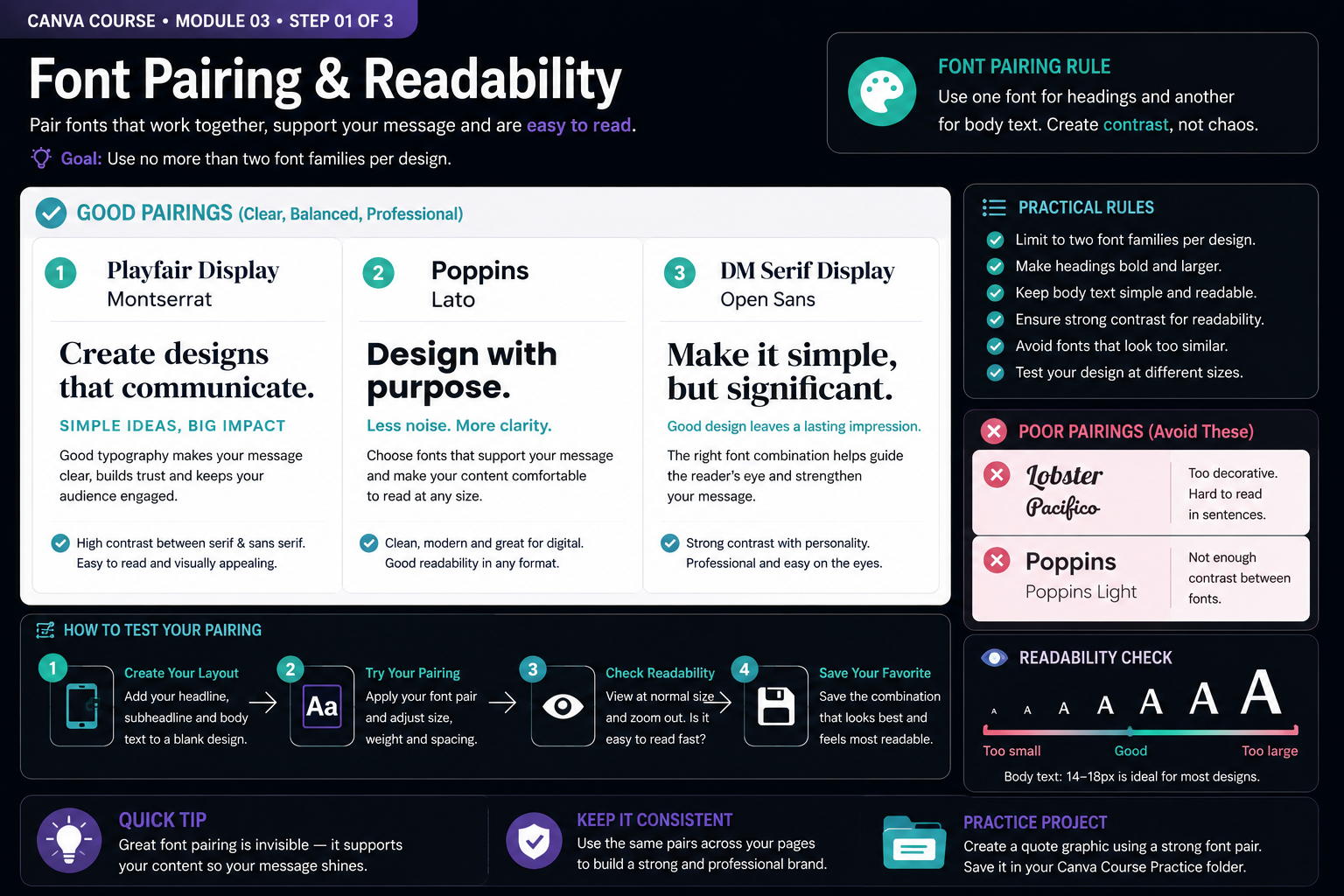
Build the Skill — Font pairing and readability
- Create a blank design with a headline, subheading and short paragraph. Choose one font for headings and another for supporting text, keeping the system limited to two font families.
- Test contrasting font combinations such as serif with sans serif. Compare size, weight, spacing and readability, and avoid pairs that are either too similar or unnecessarily decorative.
- View the design at normal size and from a distance. Confirm that the headline is immediately recognizable and the body text remains comfortable to read, then save your strongest font combination for the next exercise.
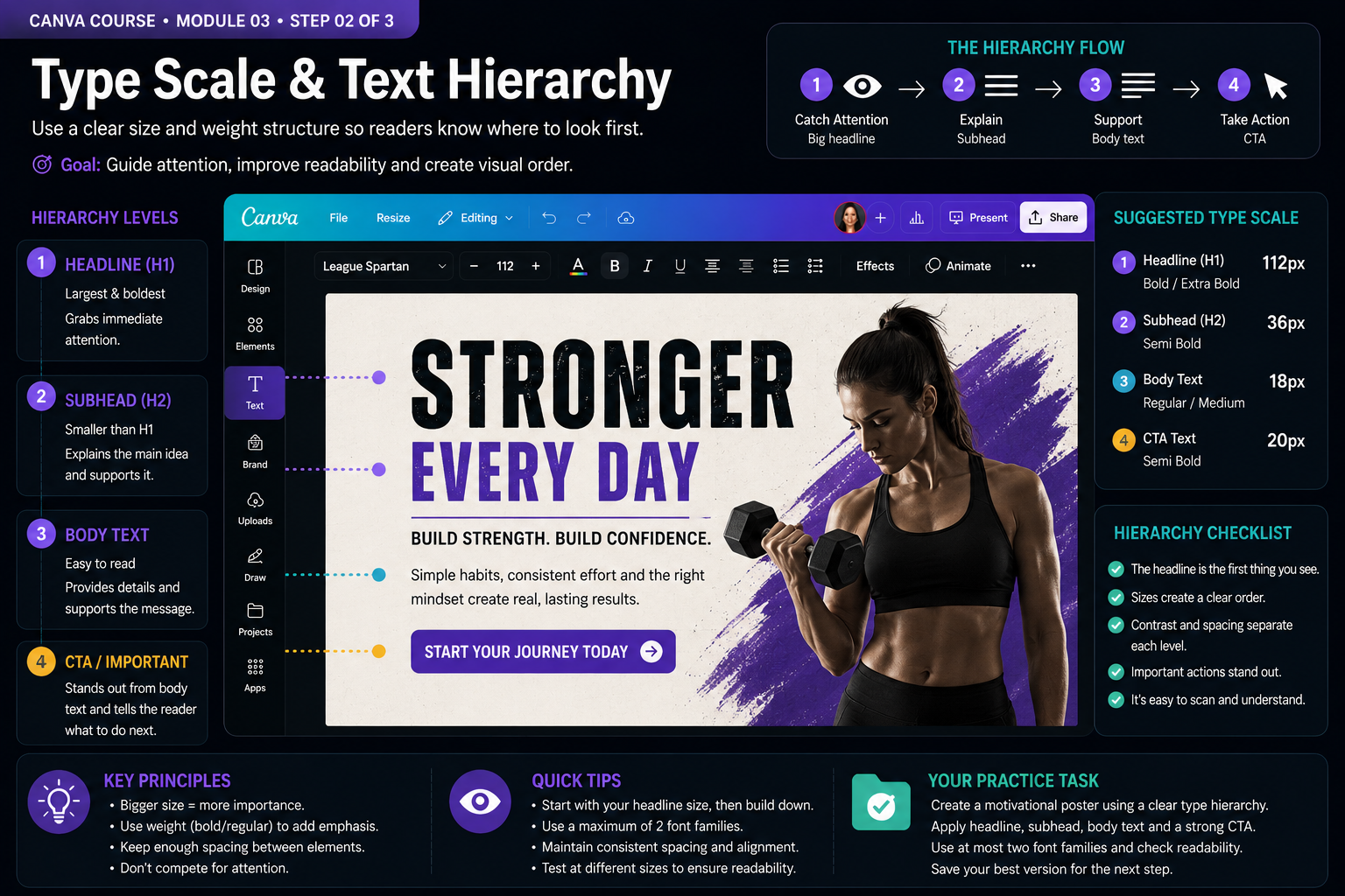
Practice With a Real Design — Type scale and text hierarchy
- Create a design with four clear text levels: headline, subheading, body text and call to action. Start with the most important message and assign the largest size and strongest weight to it.
- Build downward from the headline. Reduce size and weight for supporting text, keep body copy comfortable to read and leave enough spacing between each level so the hierarchy is obvious at a glance.
- Zoom out and check the reading order. Your eye should move naturally from headline to supporting message and then to the call to action. Adjust scale, weight or spacing until no secondary element competes with the main message.
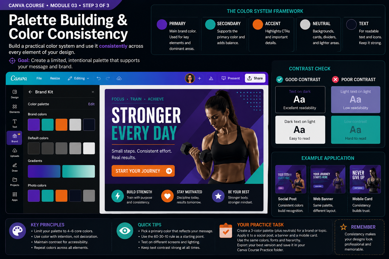
Quality Check & Export — Palette building and color consistency
- Build a limited color system with clear roles: choose a primary color, a supporting secondary color, one accent color and neutral colors for backgrounds and text. Avoid adding colors that do not serve a specific purpose.
- Apply the same palette to your headline, background, supporting elements and call to action. Check text against both light and dark backgrounds and correct combinations that are difficult to read.
- Duplicate the design and create two additional variations using the same color roles. Confirm that all three pieces feel visually related even when their layouts differ, then export your strongest version and save the palette for future projects.
Knowledge checkpoint
- Can you pair two fonts that create contrast without creating visual noise?
- Can you build a clear headline, subheading and body-text hierarchy?
- Can you explain why size, weight and spacing influence reading order?
- Can you assign specific roles to primary, secondary, accent and neutral colors?
- Can you identify a color combination that reduces readability and correct it?
- Can you reuse the same typography and color rules across multiple designs?
Create a three-slide mini style guide
Slide 1 - Typography: define your headline, subheading and body styles. Show the font families, weights and approximate sizes you would reuse in a real project.
Slide 2 - Color system: present a primary, secondary and accent color plus useful neutrals. Label the role of each color instead of displaying random swatches.
Slide 3 - Real application: create a social media graphic that uses the typography and color rules from the first two slides. The finished piece should demonstrate that your system works in practice.
Completion standard: review readability, hierarchy, contrast and consistency. Make at least three deliberate improvements, export the complete style guide and keep the editable Canva project in your Canva Course Practice folder.
Build typography as a system
Good typography is not about finding the most impressive font. It is about creating predictable roles for information. Decide which style belongs to headlines, subheadings, body copy and calls to action, then reuse those decisions throughout the project. A consistent type system helps readers understand the structure before they have read every word.
Limit the number of font families and create variation mainly through size, weight and spacing. When every text element uses a different style, the design becomes harder to scan. A small set of deliberate rules usually produces a stronger and more professional result.
Give every color a job
A useful palette is more than a collection of attractive colors. Assign roles such as primary, secondary, accent, background and text. The primary color can establish identity, while an accent color can draw attention to important actions or information. Neutral colors give the composition breathing room and help stronger colors remain meaningful.
Reuse the same roles across related designs instead of choosing new colors for every page. Consistency makes separate pieces feel connected and helps build visual recognition.
Readability comes before decoration
Typography and color must work together. Decorative fonts, subtle color combinations and visual effects may look interesting at large size but become difficult to understand on a phone or when viewed quickly. Always evaluate the design at its realistic viewing size.
Check whether important text remains clearly distinguishable from its background. If readability depends on excessive shadows, outlines or effects, simplify the combination and improve the underlying contrast instead.
Ready to move on?
You are ready when you can complete the module project confidently without depending on the example for every decision. The goal is not memorizing Canva buttons — it is learning to make sound visual decisions on your own.
Creating a Practical Type Hierarchy
Typography is one of the strongest tools available in a design because nearly every project communicates through text. A type system should make information easier to understand before it makes the design more decorative. Start by identifying the roles of the text rather than choosing fonts based only on appearance.
A simple system may contain a display or headline style, a secondary heading style and a body style. Additional styles should be introduced only when they serve a clear purpose. Too many type styles increase inconsistency and make the viewer work harder to understand the structure.
Headline typography can carry more personality because it appears in shorter amounts. Body text should prioritize readability. Highly decorative fonts that work well for a two-word title may become tiring across several paragraphs. Consider how the font performs at the actual size in which people will read it.
Weight can often create enough variation without adding another font family. One family with regular, medium and bold weights may support an entire project. This simplifies the design while maintaining a clear hierarchy.
Pairing Fonts With Intention
Font pairing works best when the fonts have distinct but compatible roles. A common strategy is to pair a more expressive heading typeface with a neutral body typeface. Another is to use one family throughout and create contrast through weight and scale.
Avoid pairing fonts that are so similar that the difference looks accidental. At the opposite extreme, avoid combining multiple highly expressive fonts that compete for attention. The goal is contrast with coherence.
When evaluating a pairing, test real content rather than only the font names in the menu. Write a headline, subtitle, paragraph and call to action. Seeing the fonts in context reveals whether the relationship actually works.
Consistency matters across pages. Once a pair and hierarchy have been selected, document the choices. Reusing the same heading and body treatments across a campaign creates a recognizable visual language.
Spacing, Line Height and Readability
Typography is not only about the shapes of letters. Line height, letter spacing, paragraph width and alignment strongly influence readability. Body text that is packed too tightly feels dense, while excessive line spacing can make related lines feel disconnected.
Long lines are harder to read because the eye must travel farther before finding the beginning of the next line. When creating documents or presentations, avoid stretching body text across the entire canvas if a narrower text block would be easier to follow.
Letter spacing can help short uppercase labels or display text, but extreme adjustments often reduce readability. Treat spacing as a refinement rather than a way to rescue an unsuitable font.
Alignment should also support the content. Left alignment is often comfortable for longer reading in languages written left to right. Center alignment can work for short titles or brief statements but becomes tiring for long paragraphs because each line begins at a different position.
Building a Controlled Color Palette
A color system should have roles just as typography does. Instead of selecting many unrelated colors, define a primary color, one or more supporting colors and neutral tones for backgrounds and text. An accent color can be reserved for calls to action or important highlights.
Limiting the palette creates consistency and makes emphasis more meaningful. If every element uses a different bright color, no color feels important. When most of the design uses controlled neutrals and brand colors, a single accent can attract immediate attention.
Consider contrast whenever text sits on color. Very light text on a slightly lighter background may look elegant on one screen but become difficult to read elsewhere. Strong enough contrast protects readability across devices and viewing conditions.
Color should also be evaluated in context. A color that looks attractive alone may feel different beside another color or over a photograph. Test combinations inside the actual design rather than relying on isolated swatches.
Using Color to Communicate Structure
Color can separate categories, indicate states and guide the eye. In a presentation, one accent may identify section titles. In a dashboard-style graphic, different colors may distinguish categories. The key is to use those colors consistently so the viewer learns what they mean.
Avoid relying only on color when the information must remain understandable to everyone. Labels, icons, patterns or text can provide additional cues. This is especially important when colors are used to indicate success, warning or category differences.
Photographs can influence the palette as well. When a photo contains dominant warm or cool tones, selecting colors that coordinate with those tones can produce a more unified design. Canva color tools can help identify colors from imagery, but the designer should still decide which of those colors support the intended message.
A useful practice project is to create the same layout in three palettes: energetic, calm and premium. Keep the typography and structure unchanged. This demonstrates how strongly color changes the emotional tone without changing the information itself.
Documenting Your Type and Color System
Once the choices work, write them down. Record font names, weights, approximate sizes, color values and the role of each style. This prevents small inconsistencies from accumulating as the project grows.
For repeated work, create a reference page inside Canva containing the approved headings, paragraph style, buttons, colors and example combinations. Duplicate from that reference when starting new assets.
A documented system also makes collaboration easier. Another person can continue the project without guessing which blue is correct or which font weight belongs to subtitles. Clear systems reduce revision time and improve consistency.
Typography and color become powerful when they operate as a system rather than as isolated decorative choices. The purpose is always to make information understandable, establish hierarchy and create a consistent visual identity.
Always test typography and color together at the final viewing size. A combination that looks balanced while zoomed in may lose hierarchy or readability when displayed on a phone or exported at its intended dimensions.