Design Principles That Make Work Look Professional
Turn basic layouts into confident designs using hierarchy, alignment, spacing, contrast, balance, grids and visual rhythm.
Before you start
Open Canva in a separate tab and complete the actions while you read. This course is designed for active practice, not passive scrolling. Keep one folder named Canva Course Practice and save every module project there.
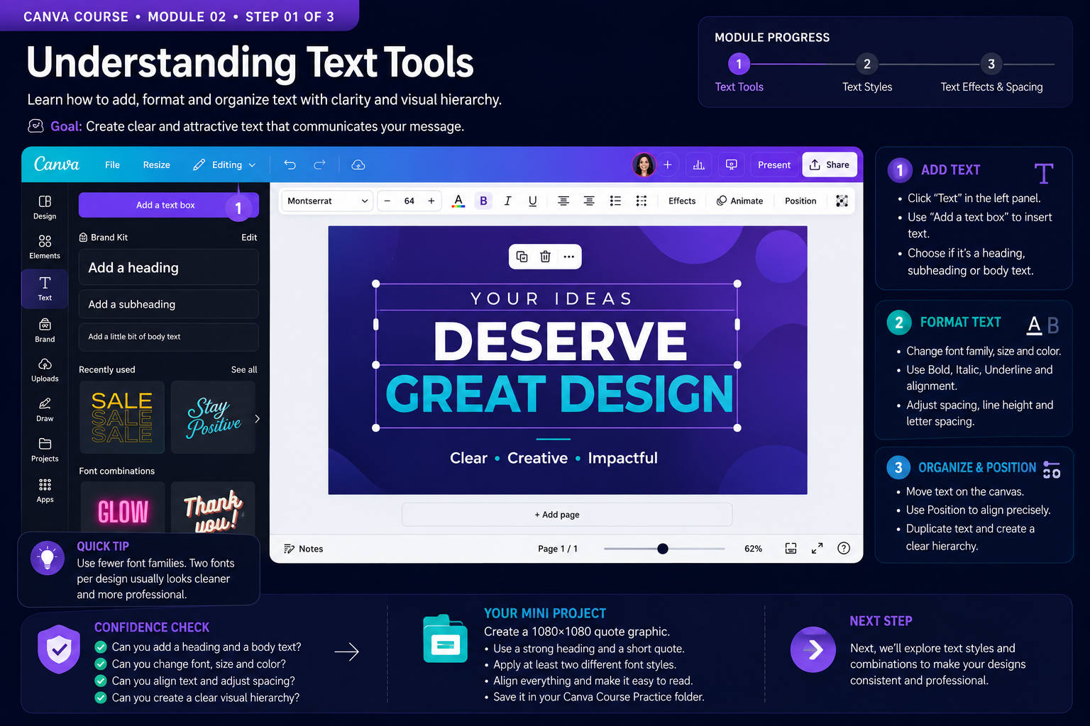
Build the Skill — Hierarchy and focal points
- Open Canva and create a fresh practice file instead of editing an old finished design.
- Follow the lesson focus deliberately. Change one variable at a time so you can see what each tool or design decision actually does.
- Save a clean checkpoint before experimenting further. This makes it easy to compare versions and recover from mistakes.
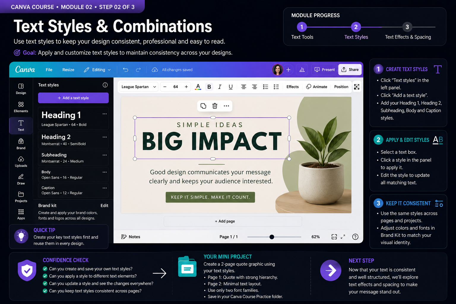
Practice With a Real Design — Alignment, grids and spacing
- Recreate the demonstrated idea using your own text, colors and assets rather than copying it mechanically.
- Check alignment, spacing, readability and consistency at 100% zoom and again from a distance.
- Make one intentional improvement that was not shown in the example and explain to yourself why it improves the design.
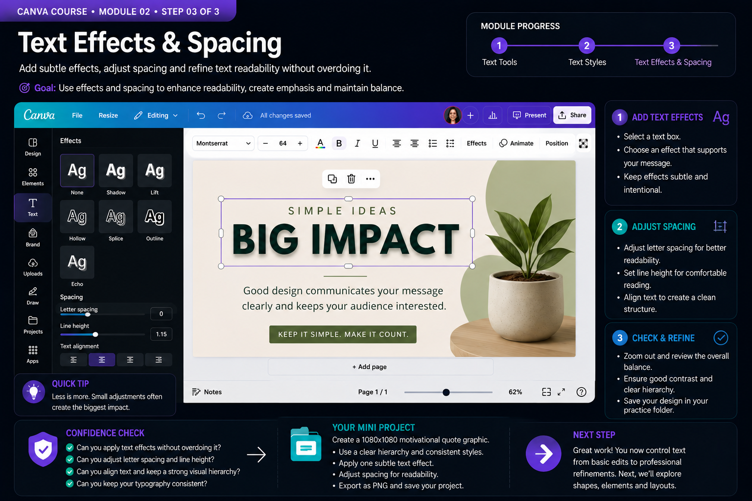
Quality Check & Export — Contrast, balance and visual rhythm
- Select your main text and test one subtle effect such as Shadow or Lift. Adjust its intensity deliberately and compare the result with no effect. The effect should support readability and emphasis rather than become the main attraction.
- Refine letter spacing, line height and text alignment. Zoom out to judge the entire composition, then return to normal size and confirm that headings, supporting text and margins create a clear visual rhythm.
- Create a 1080 x 1080 motivational quote graphic using the typography system from this module. Apply one subtle text effect, refine spacing for readability, export the finished design as PNG and inspect the exported result before saving the project.
Why visual hierarchy matters
Visual hierarchy tells the viewer what to notice first, second and third. Size is one way to create hierarchy, but it is not the only one. Font weight, contrast, color, position and surrounding space can all increase or reduce the importance of an element.
Before styling a design, decide which message deserves the most attention. A strong headline should usually dominate supporting information, while secondary details should remain easy to find without competing for attention. When everything is large, bold or colorful, nothing feels truly important.
Alignment and spacing create structure
Professional-looking layouts often rely on simple alignment decisions. Text boxes, images and shapes should appear connected to an intentional structure rather than placed randomly. Look for shared edges, consistent margins and predictable distances between related elements.
Spacing also communicates relationships. Elements placed close together are usually perceived as belonging together, while larger gaps can separate different groups of information. Instead of filling every empty area, use whitespace to give important content room to breathe.
Use contrast with a purpose
Contrast helps important information stand out and improves readability. You can create contrast through light and dark colors, large and small type, bold and regular weights, different shapes or differences in scale. The goal is not to make every element dramatically different, but to create enough distinction for the viewer to understand the design quickly.
Always check whether text remains readable against its background. Decorative effects should never make essential information harder to understand. When in doubt, simplify the treatment and prioritize clear communication.
A practical design review routine
When a design feels wrong, avoid changing everything at once. First identify the most important message and confirm that it has enough emphasis. Next inspect alignment and spacing. Then check contrast, typography and unnecessary decoration.
Finally, zoom out and judge the composition as a whole. A design should still communicate its main idea when viewed quickly. Make one deliberate correction at a time so you can understand which change actually improved the result.
Knowledge checkpoint
- Can you identify the first element your eye notices in a design and explain why?
- Can you create hierarchy without making every element bold or oversized?
- Can you align text, images and shapes using consistent visual edges?
- Can you use spacing to show which elements belong together?
- Can you improve text contrast without adding unnecessary decoration?
- Can you review a weak layout and make deliberate changes instead of redesigning everything randomly?
Build this before continuing
Create a 1080 x 1080 social media post with a headline, supporting message and one clear call to action. Build the first version intentionally with weak hierarchy, inconsistent spacing and poor alignment. Duplicate the page and redesign the second version using the principles from this module.
Completion standard: the improved version must demonstrate a clear focal point, consistent alignment, intentional spacing, readable contrast and a simple typography system. Compare both versions side by side and identify at least three specific decisions that made the second design stronger.
Export the improved version as PNG and inspect it at its actual viewing size. Keep both pages in the project so the before-and-after comparison becomes part of your practice portfolio.
Ready to move on?
You are ready when you can complete the module project confidently without depending on the example for every decision. The goal is not memorizing Canva buttons — it is learning to make sound visual decisions on your own.
Hierarchy: Deciding What the Viewer Notices First
Professional-looking design begins with hierarchy. Hierarchy is the visual order that tells the viewer what to notice first, second and third. A page can contain excellent typography and attractive colors yet still feel confusing if every element demands the same amount of attention. The designer must decide which message is most important and give it the strongest visual emphasis.
Size is one of the simplest ways to create hierarchy. A headline can be larger than supporting text, but size alone is not enough. Weight, contrast, placement and surrounding space also influence attention. A smaller line of text placed inside a high-contrast shape may attract more attention than a larger line placed in a low-contrast area.
Try reducing a design to three levels: primary message, supporting information and secondary details. The primary message should be understandable within a brief glance. Supporting information explains or strengthens that message. Secondary details, such as dates, usernames or disclaimers, should remain readable without competing for attention.
A practical test is to blur your vision slightly or zoom out. If everything merges into one visual block, the hierarchy is weak. If one area clearly dominates and the eye naturally moves to the next important element, the structure is doing its job.
Spacing and the Role of Negative Space
Negative space is not empty space that needs to be filled. It is an active design tool that separates information, improves readability and gives important elements room to breathe. Beginners often try to use every part of the canvas, which can make the result feel crowded even when the individual elements are attractive.
Think about spacing as a system. Elements that belong together should generally sit closer together than elements that represent different groups of information. A headline and its subtitle may form one group, while contact details or a call to action form another. Consistent spacing helps the viewer understand these relationships without needing additional lines or boxes.
Margins are another important part of spacing. Text and logos pushed too close to the edge can look accidental and may also create problems in print or on platforms that crop previews. Give important content sufficient breathing room from the boundaries of the design.
When a design feels too busy, removing an element is often more effective than shrinking everything. Ask whether each icon, shape, line or decorative graphic supports communication. If it exists only because the area felt empty, test the design without it.
Balance, Repetition and Visual Rhythm
Balance does not require perfect symmetry. A large image on one side can be balanced by several smaller text elements on the other. What matters is the perceived visual weight. Dark colors, large objects, detailed images and bold typography usually carry more visual weight than small or subtle elements.
Repetition creates unity. Repeating the same corner radius, icon style, heading treatment or spacing pattern makes separate sections feel like parts of one system. Randomly changing styles between sections makes the design feel assembled from unrelated pieces.
Visual rhythm develops when repeated elements create a predictable pattern. In a carousel, for example, every slide may use the same location for the slide number, headline and brand mark. The content changes while the structure remains familiar. This makes the sequence easier to follow and faster to produce.
Consistency does not mean every page must be identical. Variation can appear in imagery, emphasis or layout while core rules remain stable. Professional systems usually combine predictable structure with controlled variation.
Contrast Without Visual Noise
Contrast helps distinguish elements from one another. Light text on a dark background, bold text beside regular text and large type beside small type are all forms of contrast. Effective contrast is intentional. Random changes in color, font or size create noise rather than clarity.
Whenever two elements are supposed to look different, make the difference noticeable. Two font sizes that are almost the same often look like an accident. If one text style is a headline and another is body copy, give them clearly different roles through scale, weight or spacing.
Color contrast also affects accessibility. Text must remain readable against its background. Decorative gradients and photographs can make text difficult to read, so consider overlays, solid text areas or repositioning when necessary.
Review your work by asking four questions: What do I see first? What belongs together? Is anything unnecessarily competing for attention? Is every important message easy to read? These questions are simple, but consistently applying them leads to cleaner, more professional results.
Evaluating a Design Before Calling It Finished
Design improvement often happens during revision rather than during the first draft. Step away from the work briefly, then return and evaluate it as if you were seeing it for the first time. Look for awkward spacing, inconsistent alignment, unnecessary decorative elements and weak hierarchy.
Compare the design with its purpose, not only with whether it looks attractive. A promotional graphic must make its offer understandable. A presentation slide must support spoken information. A flyer must make essential details easy to locate. A beautiful design can still fail if it does not perform its communication task.
Use duplication to test alternatives. Create one version with more whitespace, another with a stronger headline and another with simplified colors. Comparing versions side by side teaches more than repeatedly editing the same file without preserving previous decisions.
Professional design is not about adding complexity. It is about controlling hierarchy, spacing, alignment, repetition, balance and contrast so that the message feels deliberate. Canva provides the tools; design principles determine how well those tools are used.
When reviewing a finished layout, compare every visual decision with the communication goal. If an element attracts attention without supporting the message, reduce or remove it. Strong design usually becomes clearer through subtraction, not through adding more decoration.